LAYOUT & PAPER
CREATING LAYOUT - CONFUSIONS
-
Deciding font and book size
A personal book for myself - a book like the size of a journal, smaller fonts suits the concept of the book. However, the majority of the reader of the book are over 75 years old, which made me re-think about the balance between the font size and book size.
I thought of Akiyoshi-san’s words, “It’s necessary to think about audiences for 10~15%, but you have to lose the rest.” In the end, I increased the font and book sizes by around 15%.
- The white border around the images
Initially, I thought I could easily remove the white frame around the layout by adjusting print settings for borderless printing. At a later point, I found out the white edges had to be cut manually. This affects the size of the layout and paper size.
- The difficulty of making layout in two languages
English and Japanese InDesign have different functionalities, such as hyphenation, kerning for vertical texts. Also, Japanese font is perceived larger than English font despite the same size. This has to be taken into consideration with the spacing between lines (leading), and the size of paper layout. Repeated test prints were conducted to ensure the readibility, consistency, and the overall balance.
AFTER LAYOUT - IMPOSITION
After designing the book layout, the next step involves imposition, arranging the data for each page on the paper in the correct order for printing. First step is to carry out imposition in InDesign for A4 automatically, then manually for A3. This process is repeated twice: once for the color images file for laser printing and once for a text-only file for risograph printing.
For example:
A3 File for Printing Laser

A3 File for Printing Risograph

IMPOSITION (A4)
File > Print Booklet
 2-up Perfect Bound Creates two-page, side-by-side printer spreads
that fit within the specified signature size.
Print Settings

OK > Preview > Print

The exported file is saved as PostScript File, so it's necessary to convert to PDF.
You can change it with Acrobat Distiller and choose “Press Quality.”
MANUAL IMPOSITION (A4 → A3)
Make a new file.

File > Place > Select PDF

- Repeat the same pattern 1, 2, 3, 4 for the 112 pages. It lags easily due to the large files. When delay happens, it’s easy to make a mistake.
- Rotate the 112 pages.
- Document Set Up > Uncheck Facing Pages
Export the file. I used the below paper to check, if it’s wrong, redo! Perhaps it’s better to check while you’re doing the imposition.

FINDING PAPER
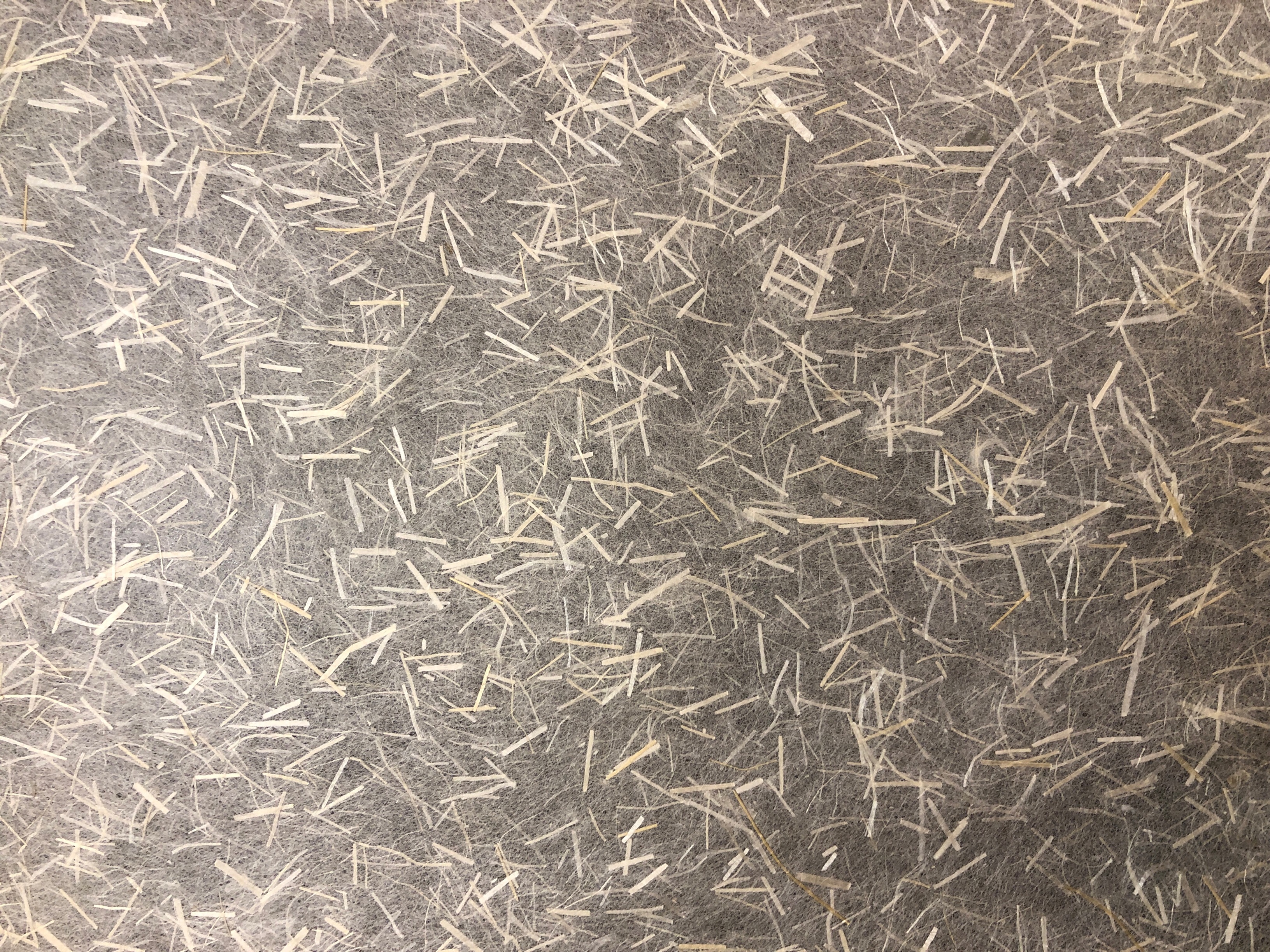
Handmade washi paper is usually made from plant-based materials, such as kozo (mulberry) and gampi fibers, and its surface fibers make printing difficult. I had to find washi-like paper, or machine-made washi.
The key was to find 70 kg ~ 90 kg paper. Thinner paper allows printed colors to bleed through to the next page, while thicker paper poses challenges during the binding process.
Ozu Washi (Nihonbashi, Tokyo)

TAKEO (Kanda, Tokyo)

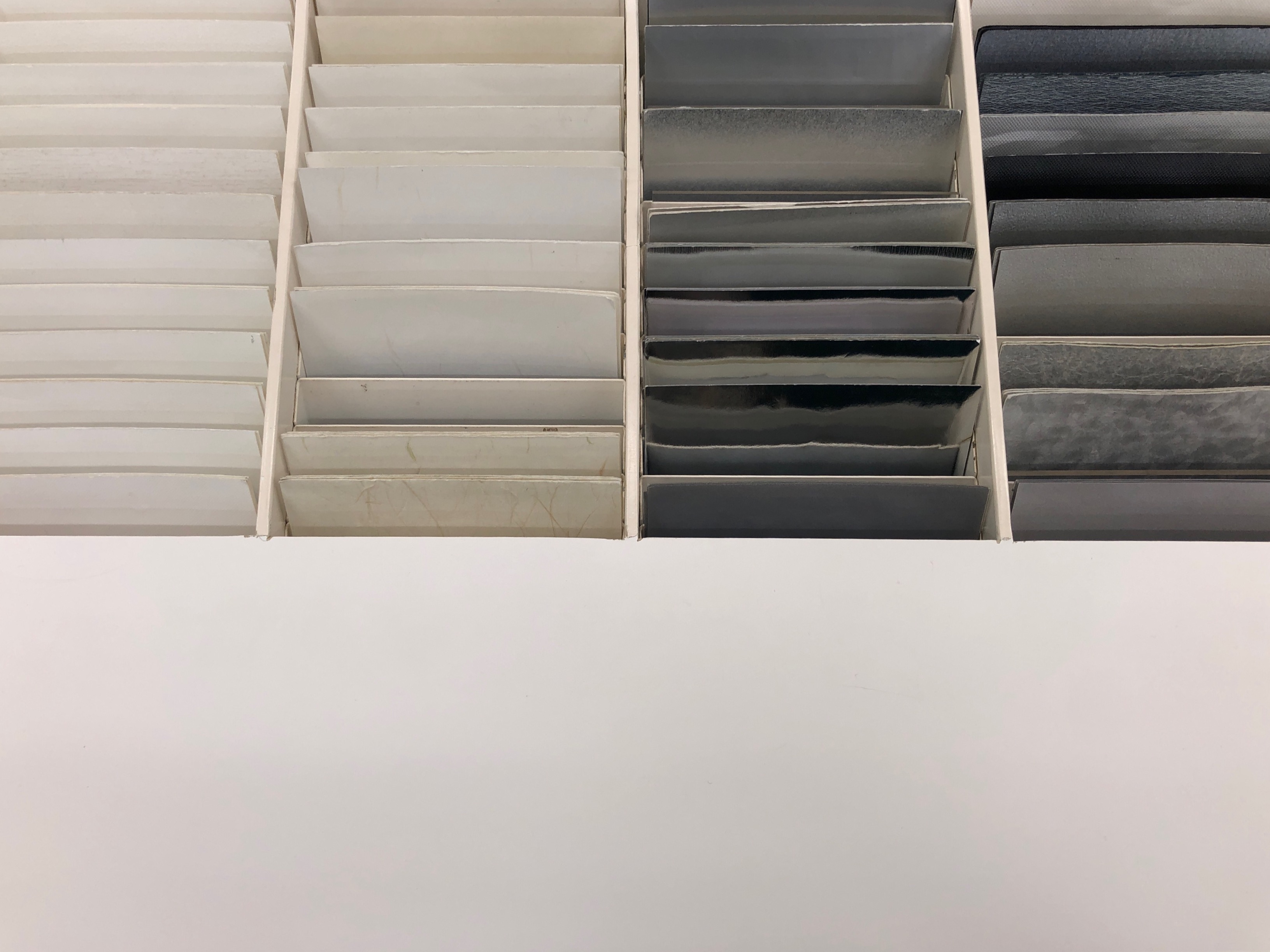
Paper NAO (Hakusan, Tokyo)
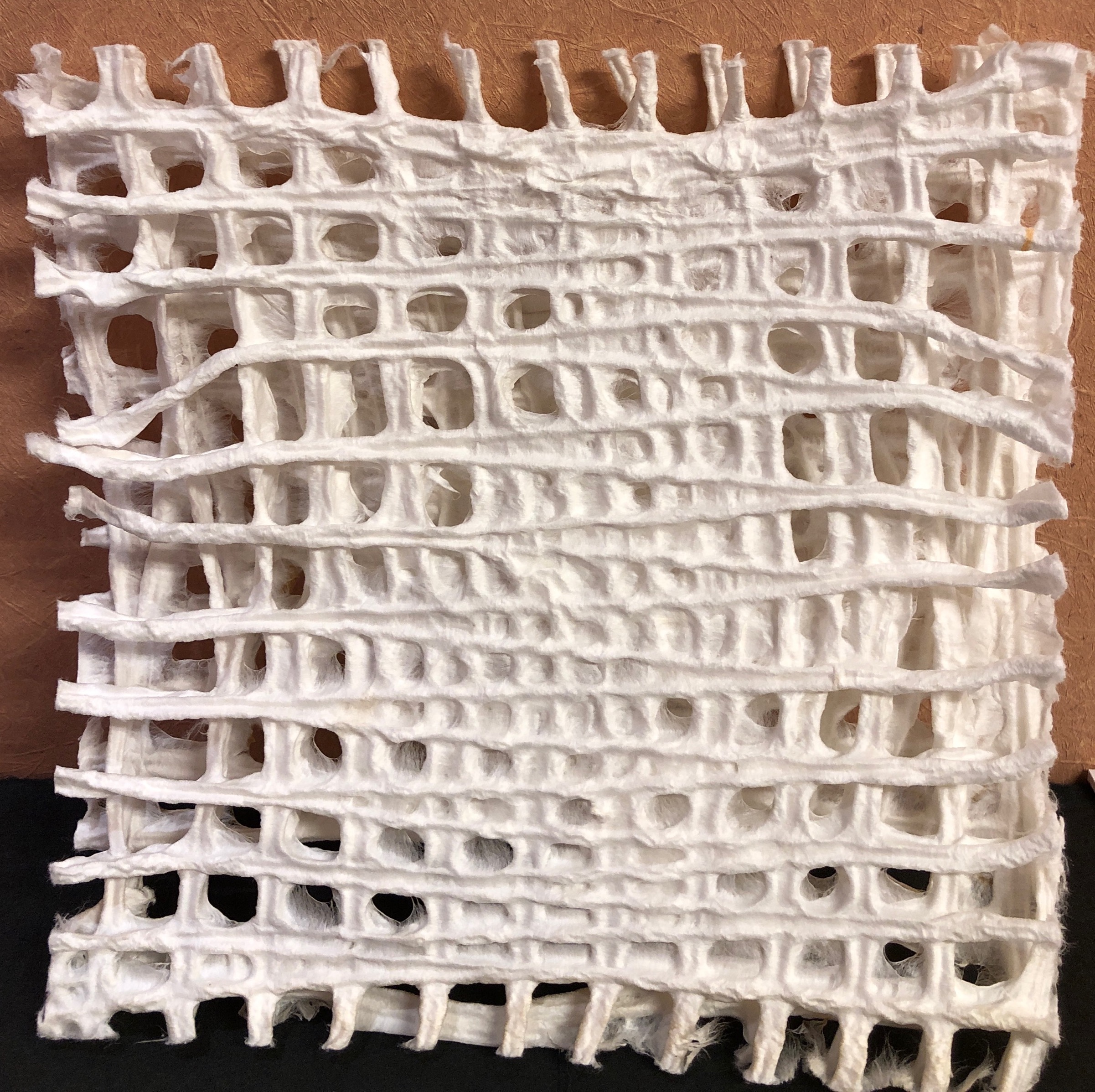
 The staffs were dying the paper with colours extracted from flowers and plants. I was drawn to the washi that was soft like a silk. I planned to place the soft paper after the front cover, which reveals contrast, a theme in the book.
Kakimoto (Kyoto)


ORDERING PAPER
Long grain paper - Thick type
28 pages (1 copy) x 9 copy (7 + back up 2) = 252 + backup 30 pages = 282 pages of A3 paper
Grain direction refers to the direction in which the fibers of the paper run, and there are horizontal and vertical grains. It is a crucial factor for folding paper, and making a mistake will make binding difficult.
A3 paper was ordered instead of A4 to control the cost of risograph printing. In risograph printing, a master is created for each page. The master is the expensive part, and the cost is similar for one and a hundred copies. Whereas the price of laser printing and machine-made washi paper increases per book.